Technical Data · Work ID
- File ID
- AC-BB-239-REV-2025
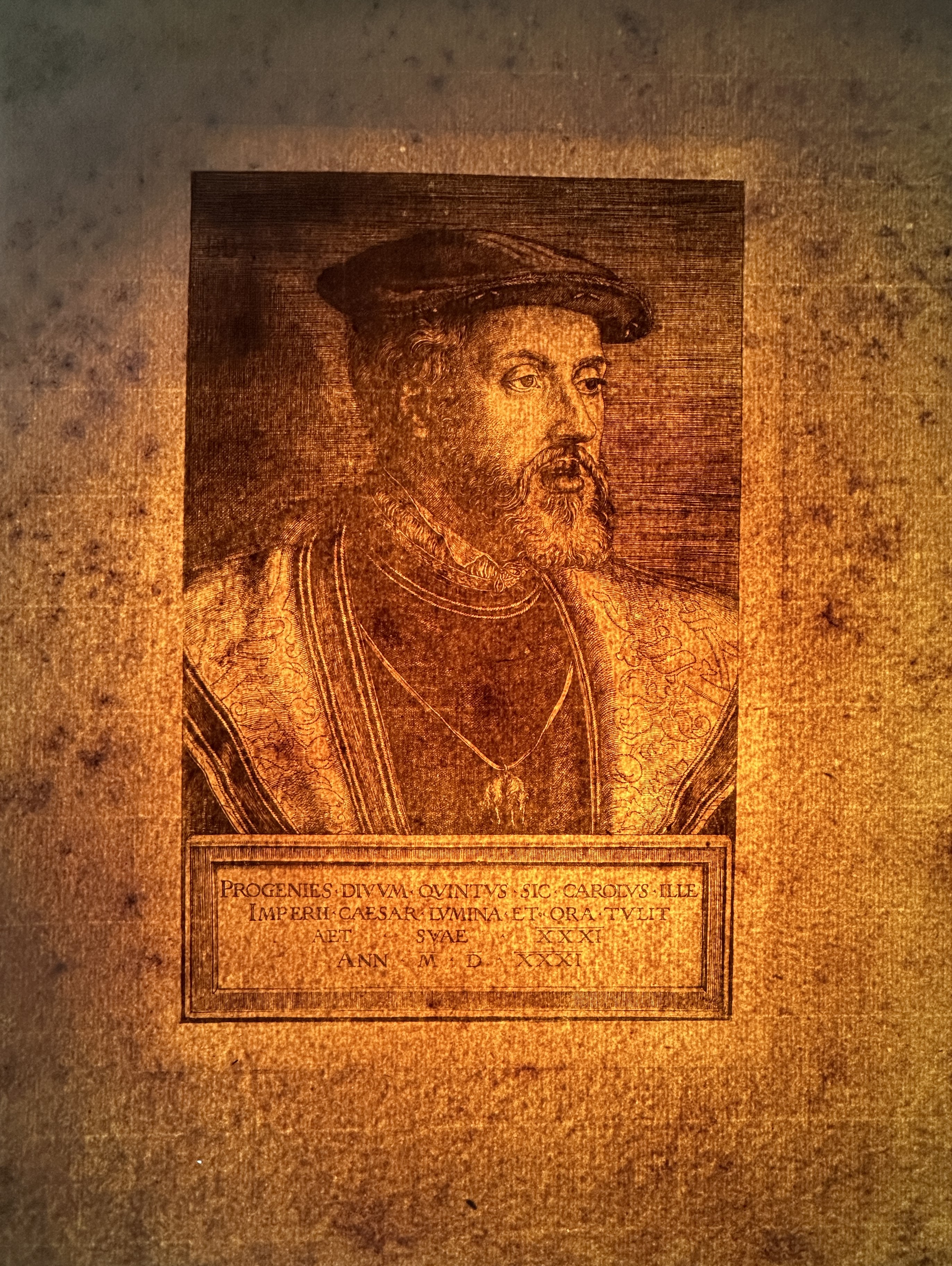
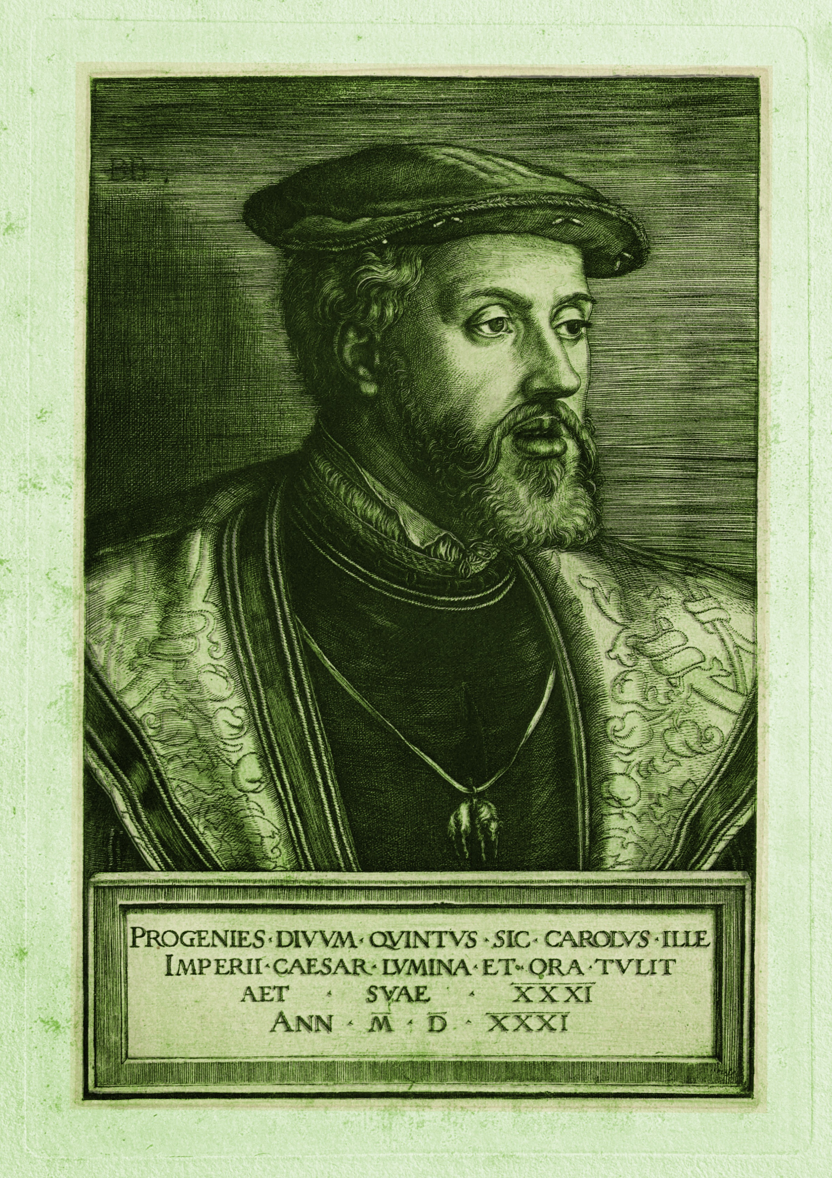
- Artist
- Barthel Beham (1502-1540)
- Title
- Charles V
- Date of Execution
- c. 1531
- Technique
- Engraving (burin) on copper
- Dimensions
- Height 216 mm × Width 146 mm
- Sheet Dimensions
- Height 316 mm x Width 250 mm
- Sheet Weight
- 15 grams
- Collection
- The Álvarez Collection (Miami)
- Provenance
- Private family collection, preserved over generations

Full composition for overall assessment (no zoom).

Reverse view to document pressure imprint and paper behavior.

Tonal inversion of the complete print used to visualize the engraved line structure across the composition. by reversing tonal values while preserving line morphology, the transformation allows the distribution of incised lines and untouched paper areas to be examined with greater clarity.
Technical research file
The impression corresponds to a very early phase in the working life of the plate, produced when the engraved lines were still fully open and responsive to pressure, as observed in every image presented here. No signs of functional wear, rounding, or loss of definition are visible—features typical of later impressions. The plate is presented here in its original operating condition, prior to the progressive flattening and fatigue observed in later printings.
Technical documentation of the work
Material presence
The work is printed on thick paper with long organic fibers, likely linen or hemp. The use of this type of paper contributes to the preservation of relief and to the active response to the pressure of the press. The ink is distributed uniformly on the paper, respecting the integrity of the engraved lines. The inscription shows sharp relief with no signs of wear.
Inscription
The inscription letters are clearly marked, with no signs of wear. The letter structure retains its original form, reinforcing the idea that this impression belongs to the earliest printings from the plate.
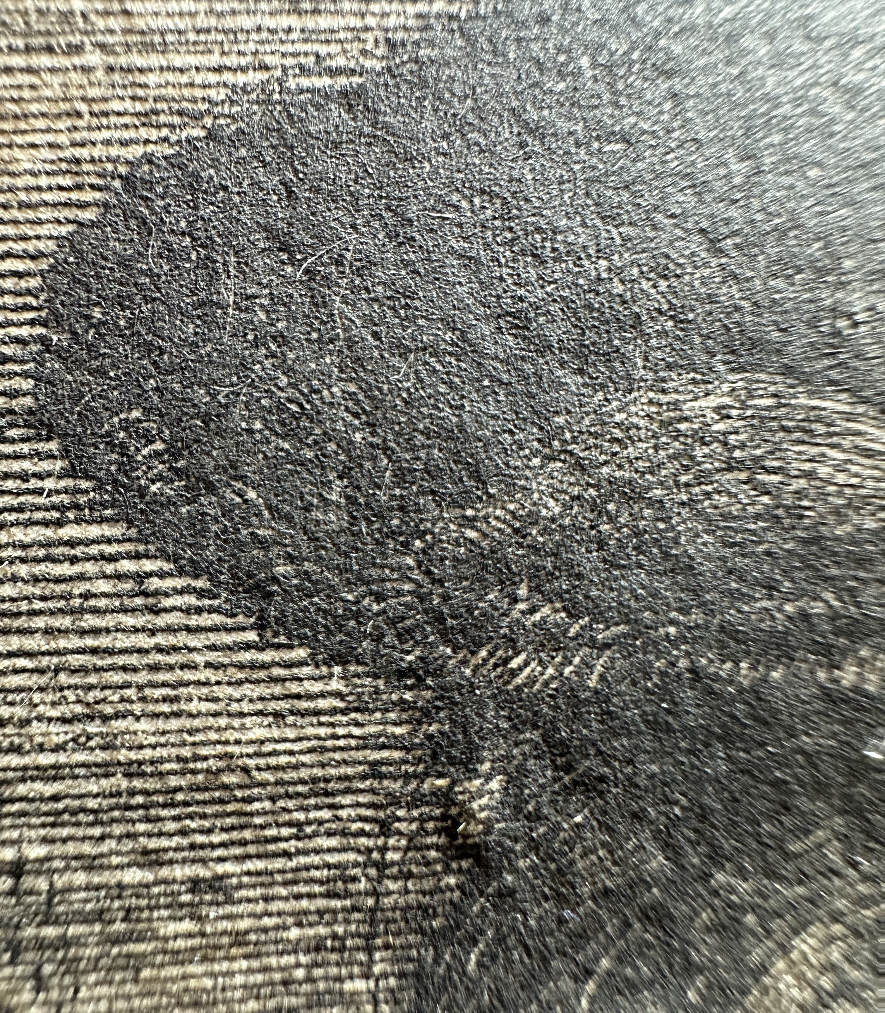
Paper and pressure imprint
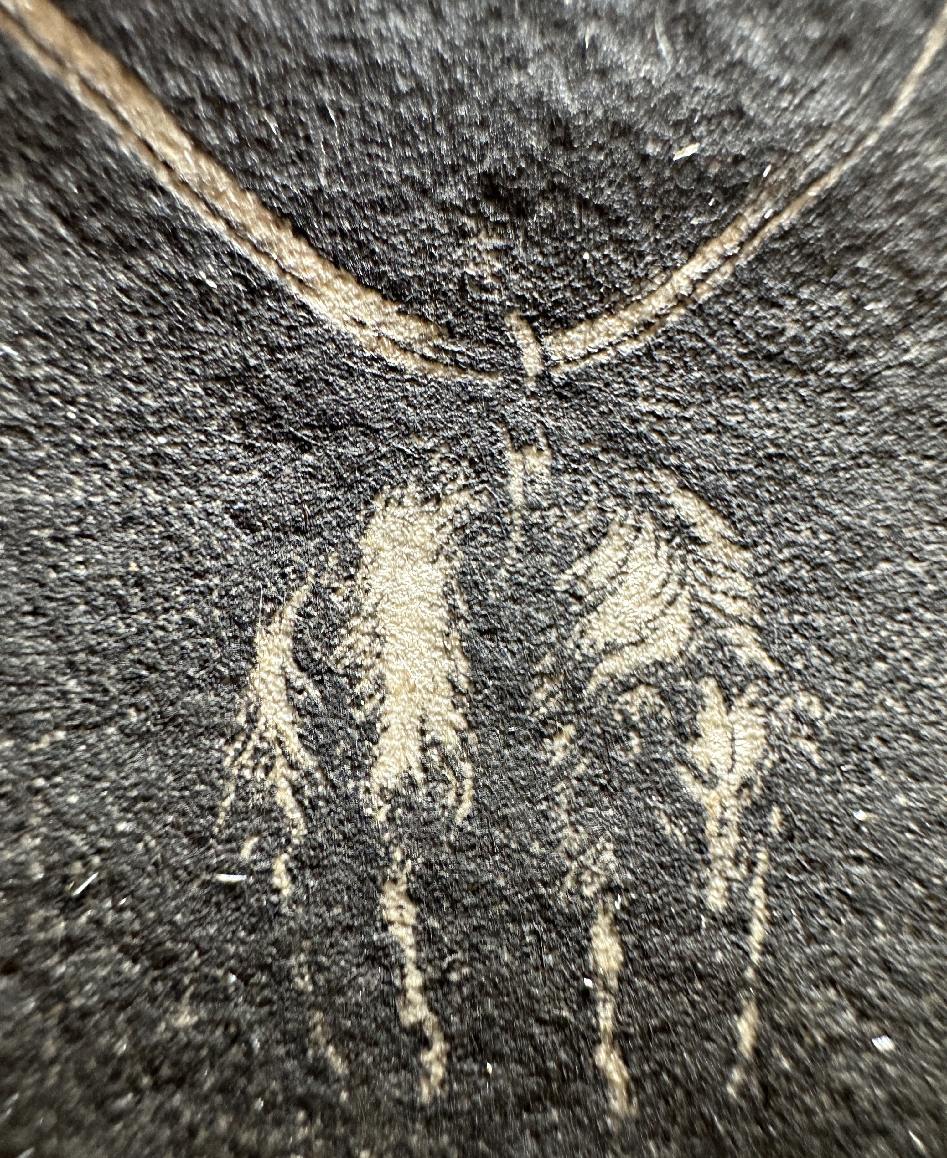
The thick paper used for the impression shows a well-defined pressure imprint, particularly visible in high-impact zones such as the contour of the eye and the face. The paper texture is clearly organic, with long fibers responding to the pressure of the press, creating deep relief. Chain-line spacing is approximately 25 mm, a distinctive feature of paper production of the period.
Watermark in this work
Why is the watermark not visible?
The thick paper used for the work, together with the dense layer of ink, makes the watermark not visible to the naked eye. In addition, the deep plate impression may have obscured any possible mark in the sheet.
Was watermark use universal in this period?
According to reference studies by experts such as Charles-Moïse Briquet (author of Les Filigranes) and analyses of Dürer’s prints, watermark use was not common in thick papers of this type. In Germany, before 1600, more than 25,000 different watermark designs existed, but their use was not universal across all paper qualities. In fact, many papers made with linen or hemp fibers—like the paper used in this work—did not show a watermark, because the priority was strength and durability to withstand press pressure.
Historical reference on watermark visibility
Historical studies such as Briquet’s and analyses of German prints from the 16th century confirm that papers used for intaglio prints in Germany were, in many cases, without a visible watermark. This was because watermarks were used more often in finer papers for important documents, not in heavier papers such as those used for printmaking.
Paper behavior and overall support documentation.

Approximate chain-line spacing as documented.
Organic fiber structure visible in transmitted light.
Line Integrity and Material Energy
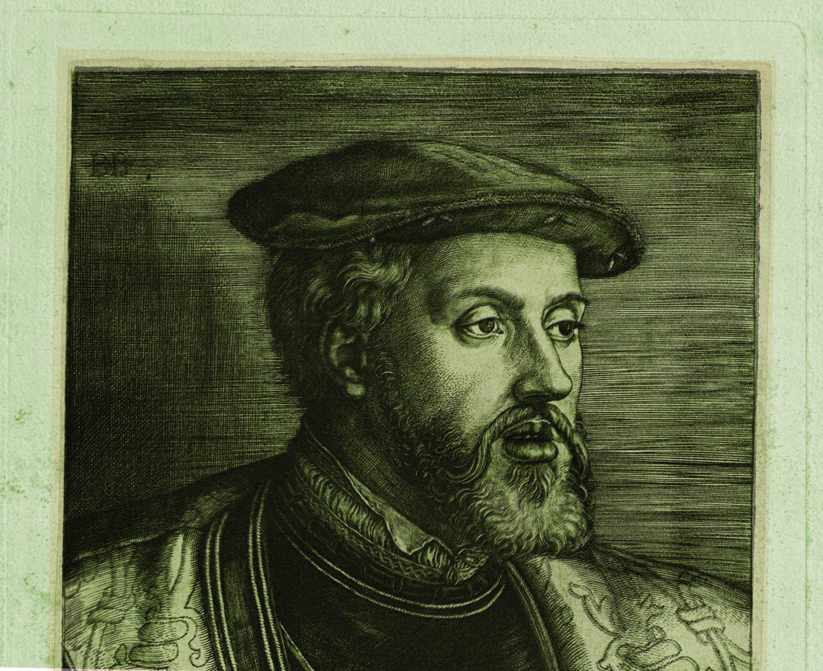
The engraved lines retain an exceptional material energy, characteristic of an impression pulled while the copper plate was in its optimum state. In critical portrait zones—such as the moustache, the gaze contours, and the deep architectural shadows—one can observe the high-definition integrity of the burin stroke. This is visible as a significant ink relief and a clear volumetric response under raking light and microscopic magnification.
This material presence is neither accidental nor decorative: it is the direct result of a deeply incised and fresh burin channel, not yet rounded or eroded by the abrasive friction of repeated printing. The preservation of these sharp edges indicates that the copper matrix had not yet suffered from plate fatigue or the collapse of the line walls—phenomena that appear rapidly in later, more tired impressions.
The graphic syntax remains open, deep, and coherent throughout the composition, even in the densest cross-hatched areas where wear typically manifests first. No flattening or uneven weakening of the image is observed, confirming that this impression was taken before any functional degradation of the matrix occurred.
The ensemble the pronounced ink relief, uniform chromatic response, and absolute line definition—places this work in the earliest phase of the plate’s life, faithfully reflecting Barthel Beham’s original technical ambition and the maximum quality this matrix could yield.
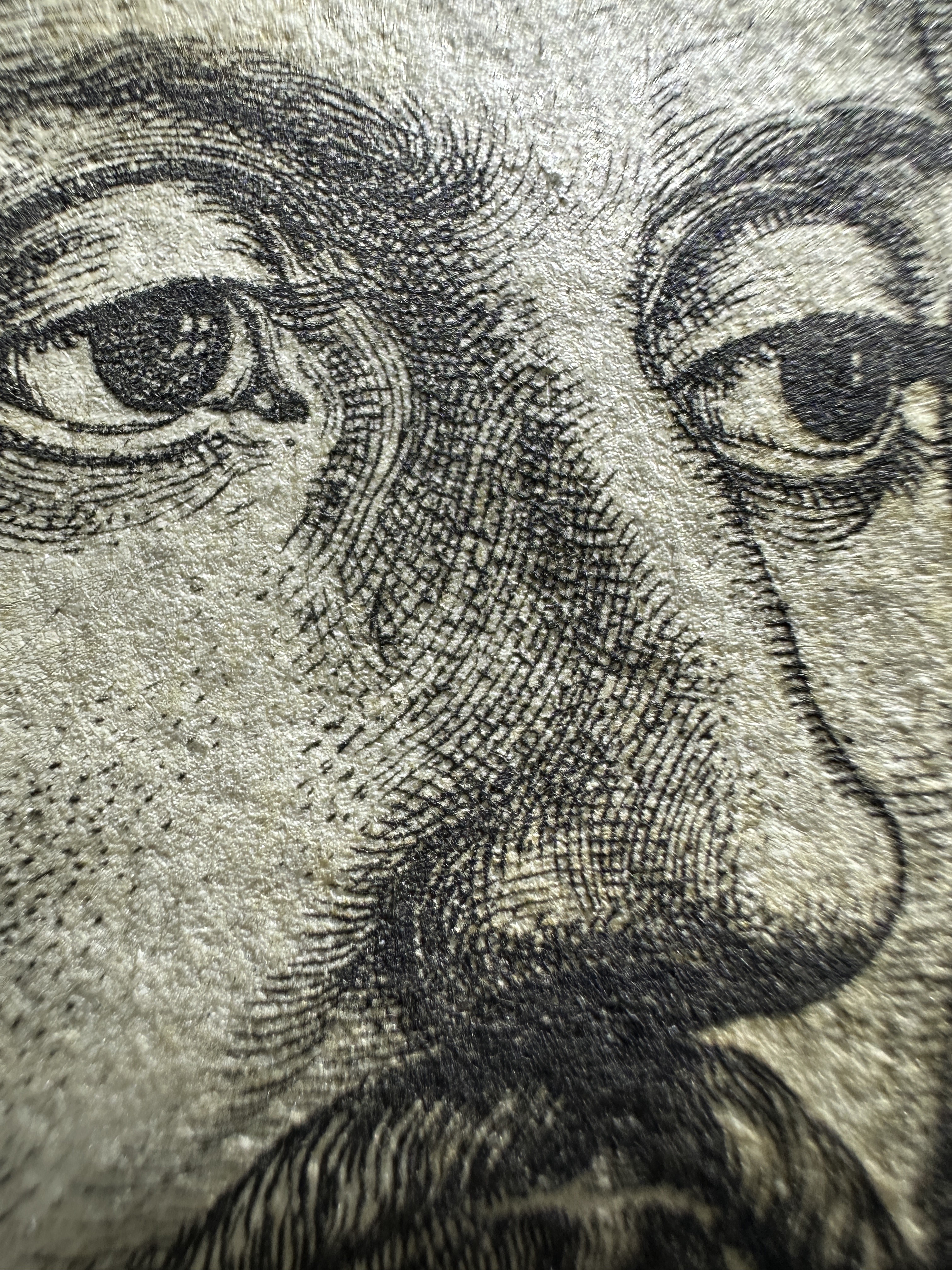
The sharpness of the eyelids and pupils demonstrates a powerful impression and the use of a matrix in optimal condition. The absence of blurred lines confirms the precision of Beham's burin, while the paper texture reveals the natural fibers of the original 16th-century support.

Detailed view of the mouth and upper beard. The material energy of the ink is evident, settling in relief on the paper fibers. The precision in the drawing of the lips, surrounded by the density of the beard, highlights Beham's technical mastery in 1531.
Macro detail capturing the material energy of the ink on the rag paper. The pigment saturation and the sharpness of the white reserves indicate optimal press pressure, typical of the first print runs. The ink respects the fiber structure, maintaining the three-dimensionality of the original stroke.


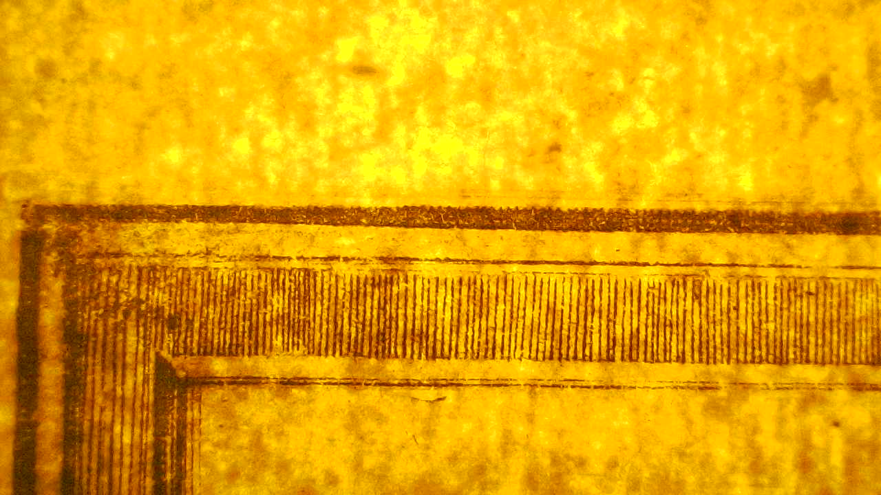
Tonal inversion of the inscription cartouche revealing the engraved lettering and the dense network of lines forming the dark background. The inversion reverses tonal values while preserving line morphology, allowing the incised line structure and untouched paper areas to be clearly distinguished.
Macrographic detail showing the intersection of multiple engraved line systems used to construct tonal depth. Parallel horizontal hatching interacts with curved and radial cross-hatching, producing darker tonal areas through increased line density rather than continuous tonal fields. The relief of the ink within the incised grooves remains visible, confirming the tonal structure is generated through engraved line work.
Microscopic observation and material behavior
The comprehensive microscopic examination of this specimen confirms, through verifiable physical evidence that we are dealing with an early state impression. This conclusion is based on three technical pillars observed in the micrographs
Integrity of the Engraving (Groove Geometry) the images [Figs. 1 and 3] demonstrate that the channels engraved by the burin retain their original "V" shape. There is no evidence of the widening or rounding of the edges that characterizes plates worn down by excessive use (later printings).
Morphology of the Inking (Intaglio Relief): The images taken with oblique lighting [Fig. 4] reveal a tangible relief of the ink on the paper. This three-dimensional accumulation of pigment is only possible when the grooves of the copper plate still possess their maximum depth, allowing for a generous and crisp application of ink.
Preservation of Microstructures: The absolute sharpness in critical areas such as the iris of the eye [Fig. 5] and the pattern of the monogram [Fig. 6] serves as a certification of quality. The absence of "blurring" (ink bleeding between lines) confirms that the press pressure and the viscosity of the oil used correspond to the standards of excellence of the period.
This microscopic analysis is not an artistic interpretation, but a material verification of the work's excellence. Through the presented micrographs, the "physical truth" that defines this 1531 print has been documented
Strength of the Matrix the consistent presence of the "V" groove and the sharpness of the micron-level details (such as the iris of the eye) confirm that the copper plate showed no wear. In a later or worn copy, these details simply disappear or become blurred.
Quality of the Printing: The tactile relief of the ink observed in the shaded areas (beard and clothing) is the hallmark of perfect press pressure and optimal pigment load. This physical volume is impossible to replicate in modern reproductions or inferior printings.
Author's Integrity: The organic integration of the "BB" monogram into the structural composition demonstrates that every element of the work belongs to the original conception of Barthel Beham, captured in its most vibrant state.
![Microscopy — Engraving Groove Geometry [Fig.1]](https://cdn.prod.website-files.com/692e3c27d1e4c87882e66826/694d782d61e7b01be4bd405e_Micro.fig.1.jpg?width=900)
Microscopic detail of a structural line executed with an engraving tool, observed under raking light. The groove geometry is clearly visible, with defined walls and ink deposited at the bottom of the cut, as well as a perceptible relief on the paper. The volumetric appearance of the line is consistent with an engraved groove in a metal matrix.
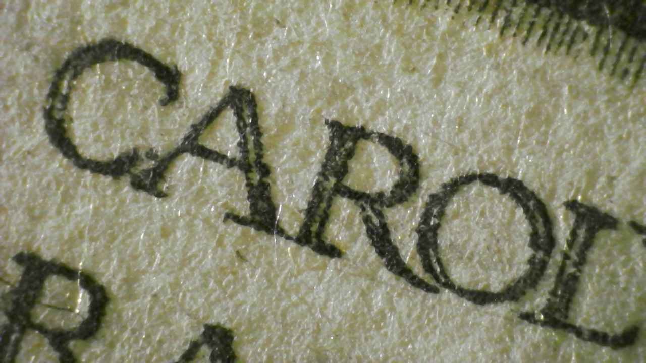
Microscopic analysis of the lower “CAROLVS" inscription reveals the morphology of the engraved strokes in the letters. The lighting allows us to distinguish the walls of the grooves and the accumulation of ink at the serifs, confirming direct manual engraving on the copper plate. The anchoring of the pigment within the fibers of the rag paper, without lateral bleeding, is evidence of balanced printing press pressure, preserving the legibility and strength of the original design from 1531.
![Microscopy — Facial Modeling [Fig.3]](https://cdn.prod.website-files.com/692e3c27d1e4c87882e66826/694d782eec15a3b12f7fa172_Micro.fig.3.jpg?width=900)
Microscopic detail of the nasal modeling reveals engraved lines with variations in depth controlled by the pressure of the burin. The strokes exhibit sharp, V-shaped cuts and a true intaglio relief, where the ink is distributed evenly within the groove without bleeding. This precision in the direct execution on the plate, preserving the microscopic separation of the incisions, is consistent with an impression made before any fatigue or wear of the metal.
![Microscopy — Engraving Marks in the Modeling of the Beard [Fig.4]](https://cdn.prod.website-files.com/692e3c27d1e4c87882e66826/694d782e8bad473fff42bc13_Micro.fig.4.jpg?width=900)
Microscopic detail of an area of maximum density in the beard, showing the ink saturation and its interaction with the paper. Under oblique lighting, the engraved grooves reveal a massive intaglio relief, with the ink accumulated in three-dimensional ridges that protrude from the paper fibers. The purity of the blacks and the absence of blurring between the curved lines confirm an early printing plate, stamped with the optimal ink load and pressure of the original printing press.
![Microscopy: Anatomy of the Gaze and Precision of Engraving [Fig.5]](https://cdn.prod.website-files.com/692e3c27d1e4c87882e66826/694d782e29c1de21f6aa5f71_Micro.fig.5.jpg?width=900)
A microscopic detail of the eye reveals the maximum definition capacity of the 1531 matrix. A pure white reserve is observed in the pupil's highlight, delimited by concentric engravings of extreme fineness that show no widening or mechanical fatigue. The sharpness of the tear ducts and the upper eyelid, where the ink maintains a three-dimensional relief on the rag paper, is definitive proof of an early impression made before the copper plate wore down.
![Microscopy: Authenticity of the Monogram and Structural Pattern [Fig.6]](https://cdn.prod.website-files.com/692e3c27d1e4c87882e66826/694d782e4d8da777e4b65d57_Micro.fig.6.jpg?width=900)
Microscopic detail of the 'BB' monogram integrated into the shaded area. Under high magnification, it can be observed that the letters of the signature maintain the same groove geometry and depth as the rest of the composition, confirming that they were engraved simultaneously on the original plate in 1531. The clarity of the monogram's lines, which show no blurring or loss of definition compared to the adjacent horizontal pattern, confirms an early impression from the plate in its most technically pristine state.
Matrix Identity Analysis (Overlay Study)
This section presents the comparative analysis using the overlay technique (digital superimposition) between the examined impression and reference impressions from internationally prestigious institutions (National Gallery of Art — 1943.3.890).
Technical Matching Points:
- Matrix Identity: The overlay demonstrates an exact match in the engraved line network, shadow hatching systems, and physiognomic features, confirming that both works originate from the same original copperplate of 1531.
- Presence of the “BB” Monogram: The superimposition aligns perfectly with Barthel Beham’s monogram in the upper-left corner, placing this piece unequivocally in State II.
- Typography and Inscription: The serifs and spacing of the Latin inscription “PROGENIES DIVUM…” show a 100% correlation, ruling out any possibility of a later copy or facsimile.
Dimensional Finding (Intact Plate):
The most relevant aspect of this study is the divergence in margins. As observed in the overlay, the museum reference image “falls within” the perimeter of our impression:
- While standard examples are trimmed to an average of 209 × 137 mm, our impression preserves the full plate impression (platemark) of 216 × 146 mm.
- This “extra margin” of copper demonstrates that the print was taken when the plate still retained its original peripheral bevel, defining it as a full-sheet impression, extremely rare in today’s market.
Expert Conclusion:
The absolute match of the internal design, combined with the superiority of the external measurements, certifies that this example is one of the early and complete impressions of State II by Barthel Beham.
Digital superimposition between the examined impression and NGA 1943.3.890 to verify matrix identity and perimeter differences.
Detail overlay of the facial area comparing the Álvarez Collection impression with the institutional reference. The precise alignment of engraved lines in the eyes, nose, beard, and facial contours confirms execution from the same original copperplate.
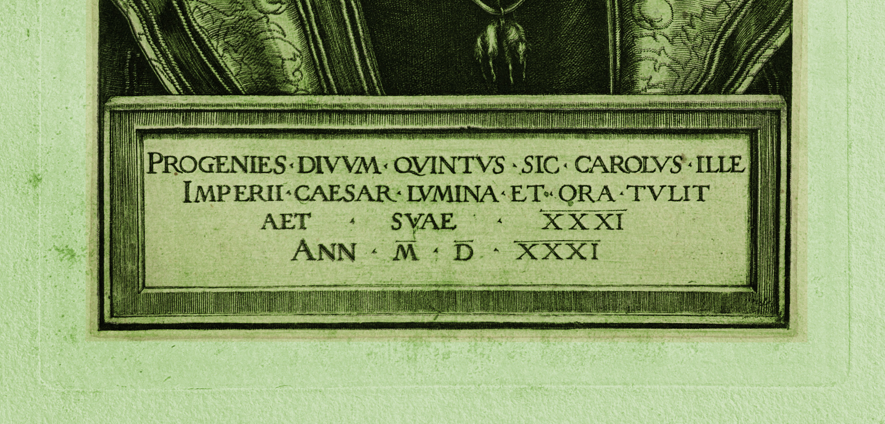
Overlay comparison of the engraved inscription panel showing complete correspondence in letterforms, serif geometry, spacing, and alignment. The identical typographic structure confirms that both impressions were printed from the same original copperplate engraved by Barthel Beham.
Early-phase condition summary
The ensemble of material evidence observed in this impression—line quality, ink behavior, paper relief, and pressure response—places the work in an early moment of plate use, when its expressive capacity remains intact. The image preserves full and stable definition across the entire surface, with no signs of exhaustion or progressive weakening, confirming that it was printed before the matrix began to lose effectiveness through continued use. This early condition allows the work to be appreciated with a clarity and visual force preserved only in the earliest impressions, directly reflecting the artist’s original technical intention.
Interactive gallery
- Zoom into burr zones and engraved lines
- Close views of paper and pressure imprint
- Inscription details and their relief
Enjoy viewing the work with the same attention as a collector or specialist, and appreciate each stroke as if you were in front of the piece itself.
Final conclusion
This PVR is designed not only to provide precise and detailed technical information, but also to enrich the visitor’s visual experience. By including an interactive gallery and a clean, professional presentation of the work, the goal is for the PVR to be not only an information point, but also a source of aesthetic appreciation.
Primary references and context
Pauli, Gustav (1901-11): Hans Sebald Beham: Ein Kritisches Verzeichnis seiner Kupferstiche, Radirungen und Holzschnitte. Estrasburgo. Reference: Pauli 90 [Estado II]..
Hollstein, F.W.H.: German Engravings, Etchings and Woodcuts, ca. 1400–1700. Ámsterdam. Reference: Hollstein 90.II (de IV)..
New Hollstein (German): The New Hollstein: German Engravings, Etchings and Woodcuts 1400-1700. Editado por Anne Röver-Kann (2021). Referencia: New Hollstein 104.II..
Bartsch, Adam von (1808): Le Peintre Graveur. Viena. Vol. VIII, pág. 109, n. º 60..
Briquet, C.-M. Les Filigranes.
Analyses of German 16th-century print papers (watermark use not universal in thick papers).
Access and Research Collaboration
High-resolution files, complete sets of macrophotographs, and the internal technical report on the Álvarez print are available to qualified researchers upon request. Comparative videomicroscopy sessions can also be arranged for institutions interested in examining the characteristics of the early stages of the work in detail.
All observations presented on this page are based on direct examination of the private print.
For inquiries, image permissions, or collaborative projects, please use the contact form on the main website or write to:
fineartoldmasters9919@gmail.com
susana123.sd@gmail.com
susana@alvarezart.info
Phone: +1 786 554 2925 / +1 305 690 2148
Álvarez Collection Verification Record #AC-BB-239-2025